I posted a couple of weeks ago with a dashboard performing some sentiment analysis on Tweets collected during Englands fixtures of the World Cup, in this post we’ll go behind the scenes to look at how it was created.
Now that are England are out of the World Cup and Argentina have won, with Messi cementing his reputation as the 🐐, now seems like a good time to write up the process of how I did the analysis. As you may have guessed, all of the processing was done in Domo. I’ve used a couple of different components within the platform; Magic ETL, Jupyter Notebooks, Stories Layouts & Domo Everywhere.
I’ll break it down in to the following steps:
- Data Collection
- Data Clean-up
- Sentiment Analysis in Jupyter
- Visualisation
- Distribution via Domo Everywhere
Data Collection
To collect the tweets during each of the games I used the Filtered Stream endpoint from the Twitter v2 API. This allowed me to create various rules to filter the incoming tweets being posted by football fans, such as ‘language’ so that I only get tweets in English, ‘tags’ to get tweets specifically for a certain fixture e.g. #ENGFRA for England vs France, or, related to the England football team e.g. #ThreeLions & whether to include retweets or not, in my case I chose to exclude retweets so that I was only collecting original content.
Starting the script to begin collecting Tweets an hour before kick-off then ending it around an hour after the final whistle meant i’d get a good range of emotion (hopefully!) as the match progressed.
Once the stream of tweets was running the results were written out to a file on my laptop. Ideally, i’d have written the data directly in to Domo, however given time constraints to get this up and running before the first match I had to go with the simplest option. I think I’ll try automating the ingestion in a future post.
As a note ofr the future, some redundancy would also have been a nice to have, as, during the Wales match my stream was cut off while I was at the pub, sadly resulting in around only 15 minutes of tweets collected for that fixture
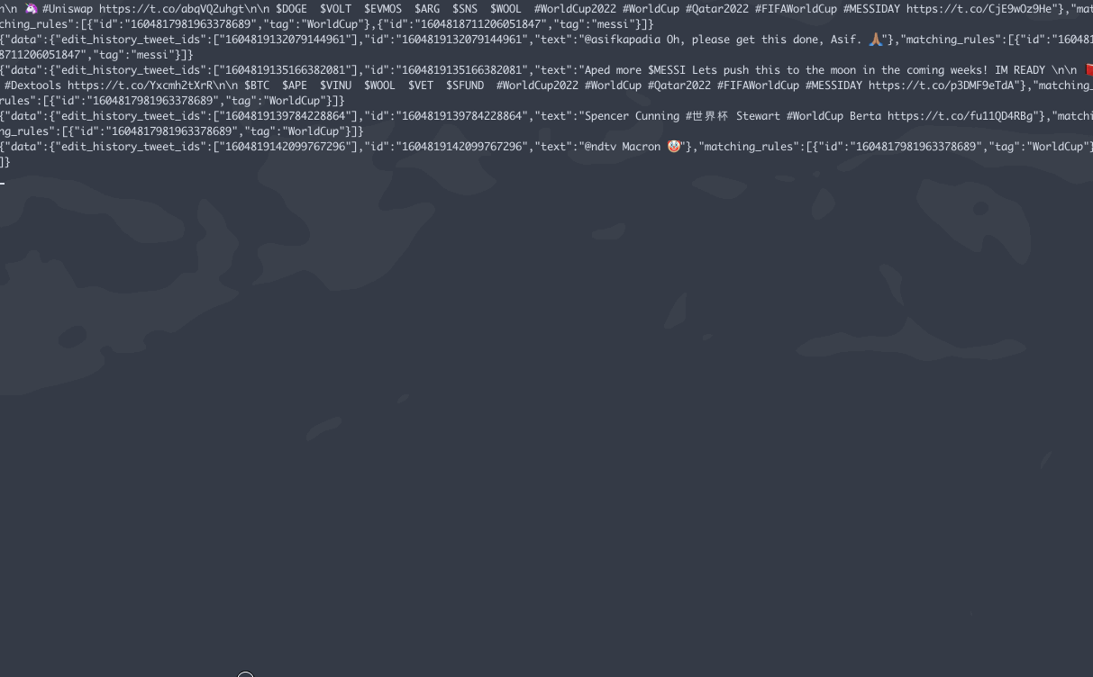
Once closed off at the conclusion of the match, the files were uploaded to Domo.
.gif of stream file
Data Clean Up
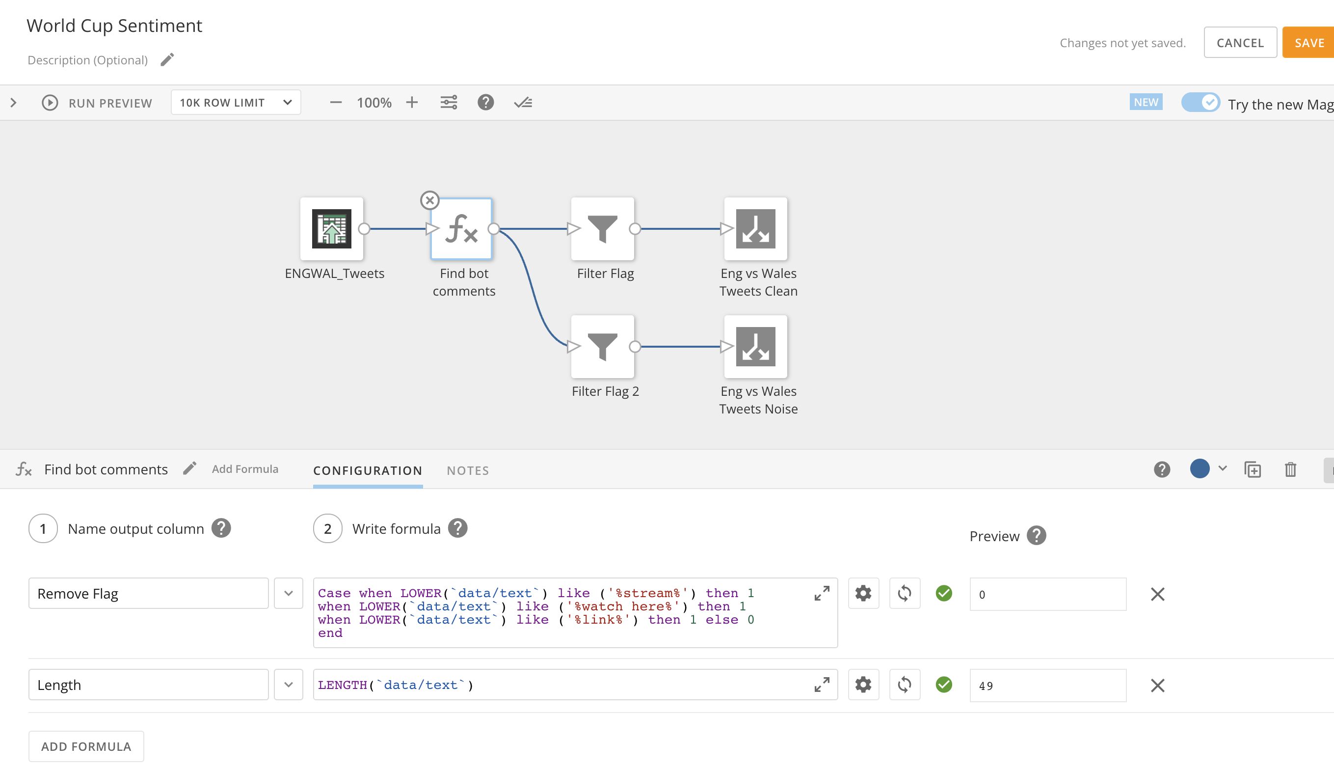
Once the data was uploaded to Domo I used Magic ETL to do some basic clean up. This step honestly could have and probably should have been replaced with Jupyter, however, I work quicker in Magic ETL and know it a little better.
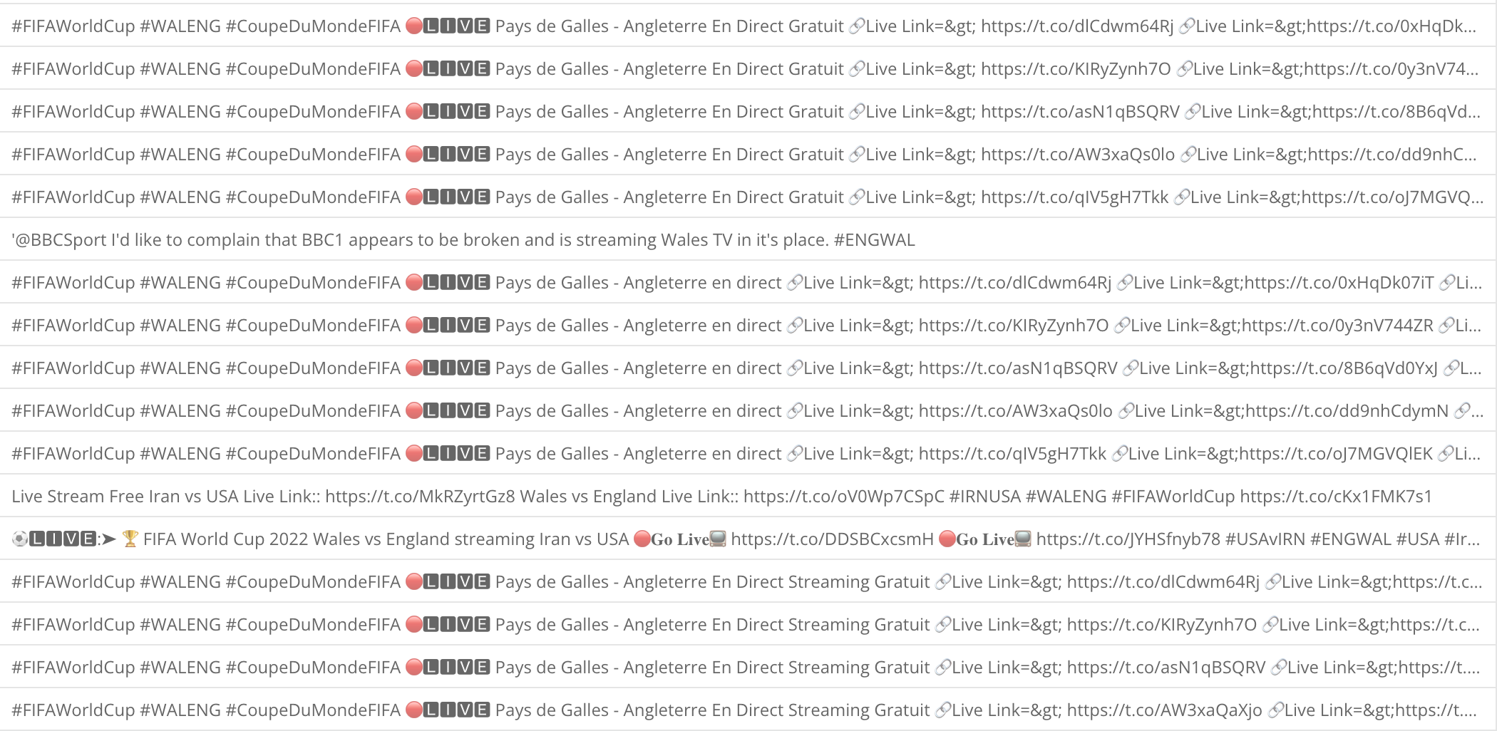
In the end it turned out to be an incredibly simple dataflow to filter out any tweets that were promoting streams of the game to watch with some presumably dangerous URL to click. Given the uniformity to the tweets, I would guess they were coming from bot accounts.
Dataflow to remove bot tweets
Some of the Tweets removed during the dataflow process
Sentiment Analysis in Jupyter
This was the first time that i’d used the Jupyter Notebook integration with Domo. Essentially, it allows you to create a Notebook with either a ‘Python’ or ‘R’ kernel, then, once started allows you to either make external API calls to add data, or allows you to load in any of your existing Domo datasets to perform analysis on.
Jupyter notebooks are ubiquitous in the data science world for their ability to illustrate the analysis being performed step by step by arranging code, images, text and output in a step by step manner. They ultimately help data scientists / analysts to document their thought process while developing the analysis process.
For my analysis I loaded in Domo datasets to the workspace, specifically the output of the Magic ETL dataflow from the previous ‘Data Clean Up’ step.
Once the data is in the notebook, there’s some manipulation & cleansing with Python, then towards the end the model is applied against the tweet text. In this example i’ve used the j-hartmann/emotion-english-distilroberta-base model to apply the classification.
The model applies the emotion column seen in the table below, with a classification of 1 of 7 possible values (anger 🤬 ,disgust 🤢, fear 😨, joy 😀, neutral 😐, sadness 😭, surprise 😲). It also applies a score between 0 and 1 as to to the accuracy of the classification based on the data used to train the model.
On reflection, I’d say its had fairly limited success in its application. Attempting to ascertain the emotion of an England football fan, with the specifics of lexicon that are used, have led to quite a large amount of false positives. For example, a lot of swearing is used in a positive manner to celebrate a goal which the model interprets in most cases as Anger.
Take a look at the table below, which shows a sample of 50 of the classifications applied to Tweets mentioning Harry Kane during the England vs France match, would you agree with all of those applied emotions? I probably wouldn’t…
Jupyter Notebook Code
If you’d like to try out the sentiment analysis for yourself, the code is below, with one block per notebook step. You’ll need to make adjustments according to the names of the datasets & columns for your own application. If you don’t have Jupyter Workspaces in Domo, this notebook will work in a standalone version.
I feel like at this point I should also add a disclaimer to state that I am by no means a data scientist, this was simply a fun project where I could play around with some new platform features. I have to thank Jace Mclean at Domo for sharing the original Jupyter code with me, which I’ve adadpted for this World Cup / Twitter use-case.
GitHub Link to the .ipynb file
| |
| |
| |
| |
| |
| |
| |
| |
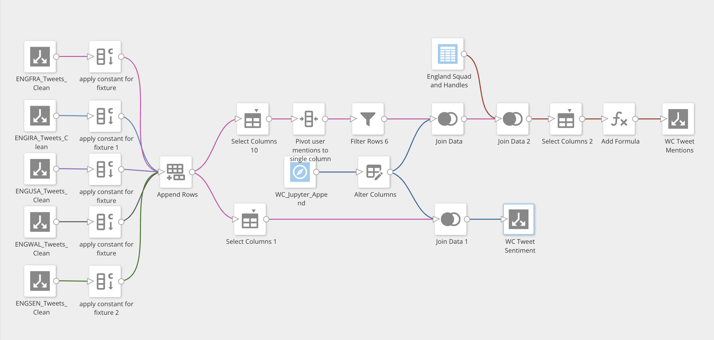
Final Dataflow
There was a subsequent and final dataflow created to join the output of the Jupyter analysis complete with emotion classification and score back on to the ‘raw’ tweet data.
At the same time the dataflow also performs a pivot of the data, whereby any @ mentions from a tweet which are collected in separate columns, are appended in to a single column. A lookup table of England player twitter handles is also joined to the now pivoted @ mentions. Doing so allows filtering at the dashboard level for any specific England player, or, for the England squad as a whole.
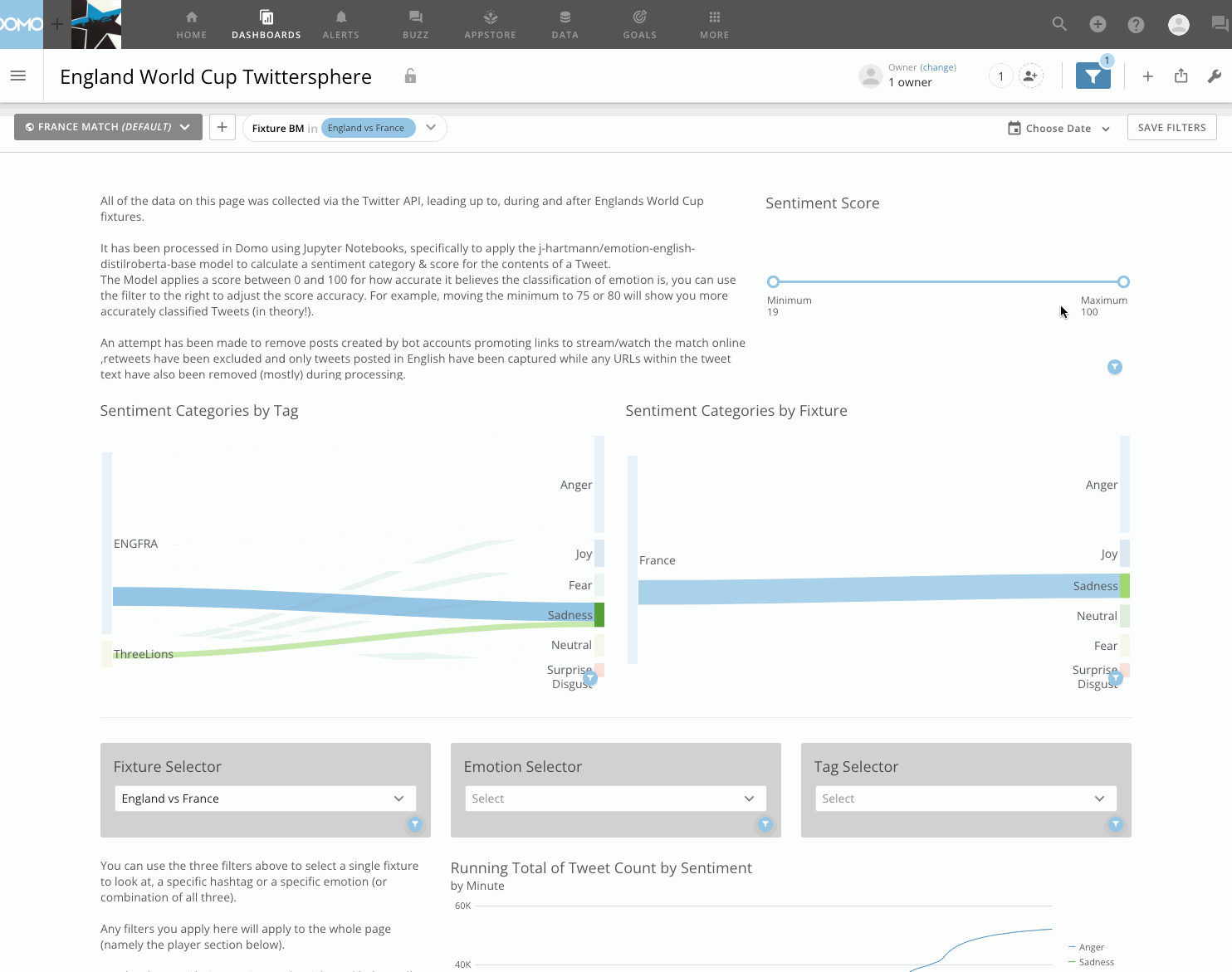
Visualisation
There’s nothing overly complex happening in the dashboard, it’s mostly a combination of typical charts. Although, I do like the Sankey charts to show the tweet volume moving from a certain fixture or tag to an emotion, which can be further filtered to a specific player. Bar charts by minute show the emotion breakdown at a granular level, while the heat-map (below) displays emotion classification between players for any given fixture. I think there’s room for improvement with the dashboard if I was being critical, however the focus of this post was on the Jupyter integration and the sentiment analysis.
Distribution via Domo Everywhere.
Another incredibly straightforward component to get working is embedding and publishing this dashboard publicly.
Using ‘Domo Everywhere’, with 3 clicks I am able to generate an iframe URL that I can take and place in to any HTML page to share content externally.
This was the process used on my last post to embed the whole dashboard, or, if I wanted to embed only a single visualisation like in this post for the table, sankey & heatmap above, I can generate a URL for only individual cards, with the option to enable drill paths, filtering, the render size.
Things would get a little more complex if I wanted to embed the content privately by defining some permissions and restrictions on who can view the content, I think that process probably justifies its own post in the future.
Check out (yet another) .gif below showing how I generated the embed URL to share this dashboard with you directly from my Domo instance.
And thats it!
If you have any questions on this process i’d love to hear from you! The best place to reach me is on LinkedIn (I had to remove my email due to spam).